A simple bedroom makeover
From the moment we first viewed our cottage over two years ago, I couldn’t wait to decorate our bedroom.
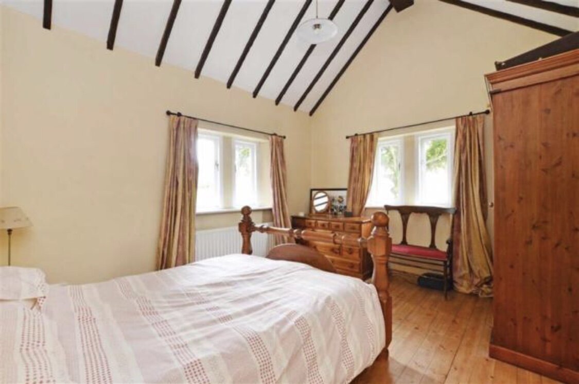
I’m both cursed and blessed with an over active visual mind and it set to work as soon as I laid eyes on this space. The double aspect windows, countryside views, exposed wooden floorboards and high beamed ceilings were music to my eyes. I could see straight through the previous owner’s style, which was quite different to mine, and I was chomping at the bit to get started.
I set to work collecting inspiration on Pinterest and quickly realised I wanted a bright light space that also felt cosy, full of character, calm and relaxing. I know from many years of pinning that white bedrooms make my heart flutter but I felt excited to combine minimal with character. A simple bedroom that doesn’t try to do too much but is still a beautiful and functional was my brief.
What we did
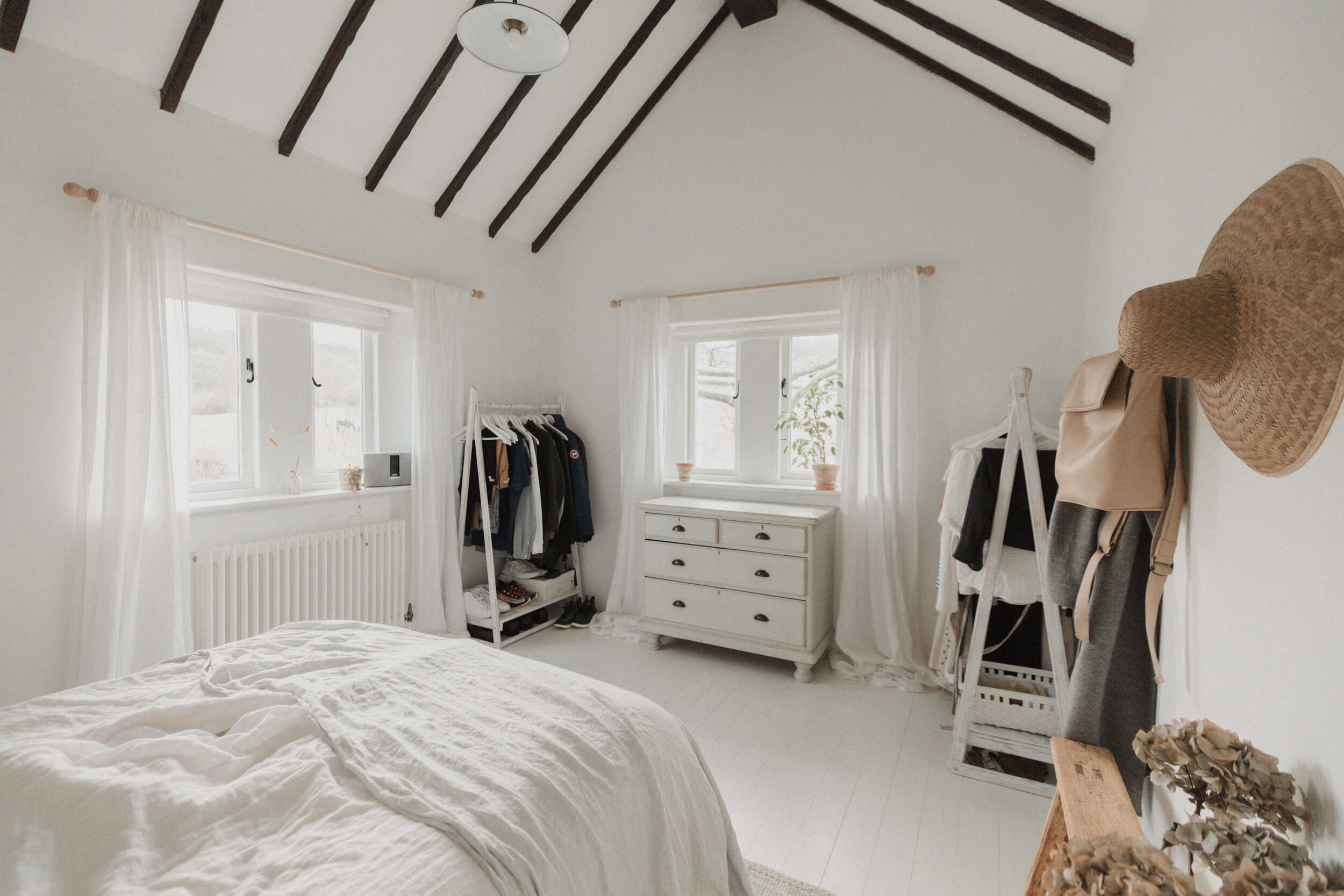
Getting started was the easy part. A few weeks after we moved in (as soon as the decorator could fit us in) the entire cottage was decorated in the same *Loft White. I chose this colour because it was the brightest white I could find and I wanted to brighten the rooms up as much as possible. The cottage only has windows on one side so light can be an issue. They say never rely on white paint to bring light into a space but seen as there was two windows worth of light coming in, the Loft White definitely did the trick in this room.
The floors were sanded before being primed and painted in *Farrow & Ball’s All White floor paint. The basics are the easiest part of decorating for me, it’s the details where I run into trouble. This is why it’s taken almost two years since moving in to write this post. Only now doesn’t it feel truly (sort of) finished.
Our bedroom in the previous house had a fitted floor to ceiling triple wardrobe and wall to wall fitted drawers so we had no storage when we first moved into the cottage. This made for an interesting experiment in assessing how much storage we actually needed as opposed to how much stuff can we fit into the storage we’ve got. I wanted to keep the space as clutter free as possible.
Open rails as wardrobe storage have been trying to seduce me for years and eventually I managed to convince J into giving them a try (as long as he also got another wardrobe in the spare room as well as two chests of drawers). I found these rails on Etsy and as the space either side of the window is a bit tricky, I emailed to see if made to measure would be an option. Buying from independent makers means this usually isn’t a problem and that’s why these fit the space perfectly.
The practical side of me worried about dust, but honestly I haven’t found it bad at all. I’m not even sure where I would put fitted wardrobes in this room as the windows make it awkward. In addition to the rail I put up a peg railwith a vintage bench underneath so I could hang accessories, add some nature in and frame the shoes I keep in my bedroom.
The bedhead was the hardest piece to source and took months of searching. I was aching for a vintage one but the right match never came up. I saw this online (now sold out) and it was just the style I’d been looking for. When it arrived I immediately dragged it up the stairs and put it into place. I love how it adds deeper neutrals and texture to the room.
The bedside lights are ceramic pendants (which have recently doubled in price) and took a few tries to get right. I found these pendants and simply asked the makers to pop a plug on the end for me. The brass hooks they hang from are coat hooks but add the touch of metallic I wanted for contrast.
I’m a sucker for *vintage stools and I love using them as side tables. They don’t offer much in the way of storage but they keep the room clutter free and look beauuuuutiful. I put up a couple of *oak hooks on J’s side so he could have a basket for all his bedside essentials.
How it turned out
I’m so pleased with how this room turned out. This is my favourite place to be in the entire world, the second is wallowing in my bath with a book next door. Taking the necessary time the think about how I wanted the space to feel and how I needed it to function was all worth it.
I think keeping the colour palette simple and using natural details works really well. I’ve managed to convince J that storage can indeed be beautiful and that technology doesn’t have to exist in a bedroom. The vintage tints are my favourite thing about the bedroom, mainly the chest I threw myself over as soon as I saw it at the vintage shop down the road. Texture is also an important feature for me in this room. One of the biggest lessons I’ve learned when it comes to curating a simple, neutral space is the importance of texture. You really can’t have enough. The wool rug, linen bedding and linen curtains bring a touch of romance to the room for me.
It’s taken two years to get to the point where I’m happy with this room and I’ve done plenty of tinkering along the way. Slow decorating is quite new for me but I’m enjoying this side of the fence. I used to live in the I want it done, and I want it done now camp; honestly it was exhausting. I rushed into making decisions too quickly and never gave myself the time I needed to contemplate and curate a space feature by feature, with love.
Moving forwards I’m looking forward to playing with the base colours I went for. I was so desperate for a clean, bright blank canvas I went with white white (I told you I wanted it all I wanted it now). After living with it for two years I’m thinking I’d like to tone it down a little and add some depth. This room gets beautiful light throughout the day because it faces south and I think a different shade of white would highlight that beautifully.
So what do you think? Let me know in the comments.
If you’re looking to create your own version of a beautiful, minimal and cosy space, my simplified home ebook is designed to walk you through the process I use step by step. You can find out more about it and decide whether it’s right for you here.


