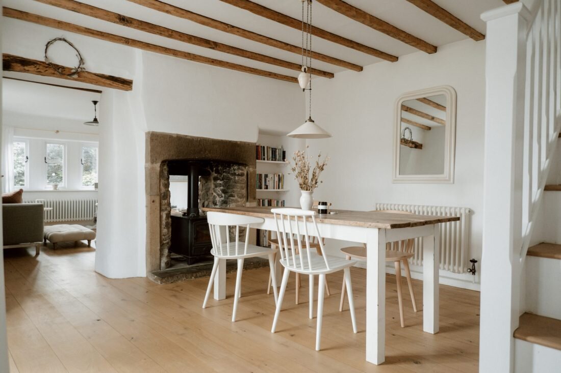
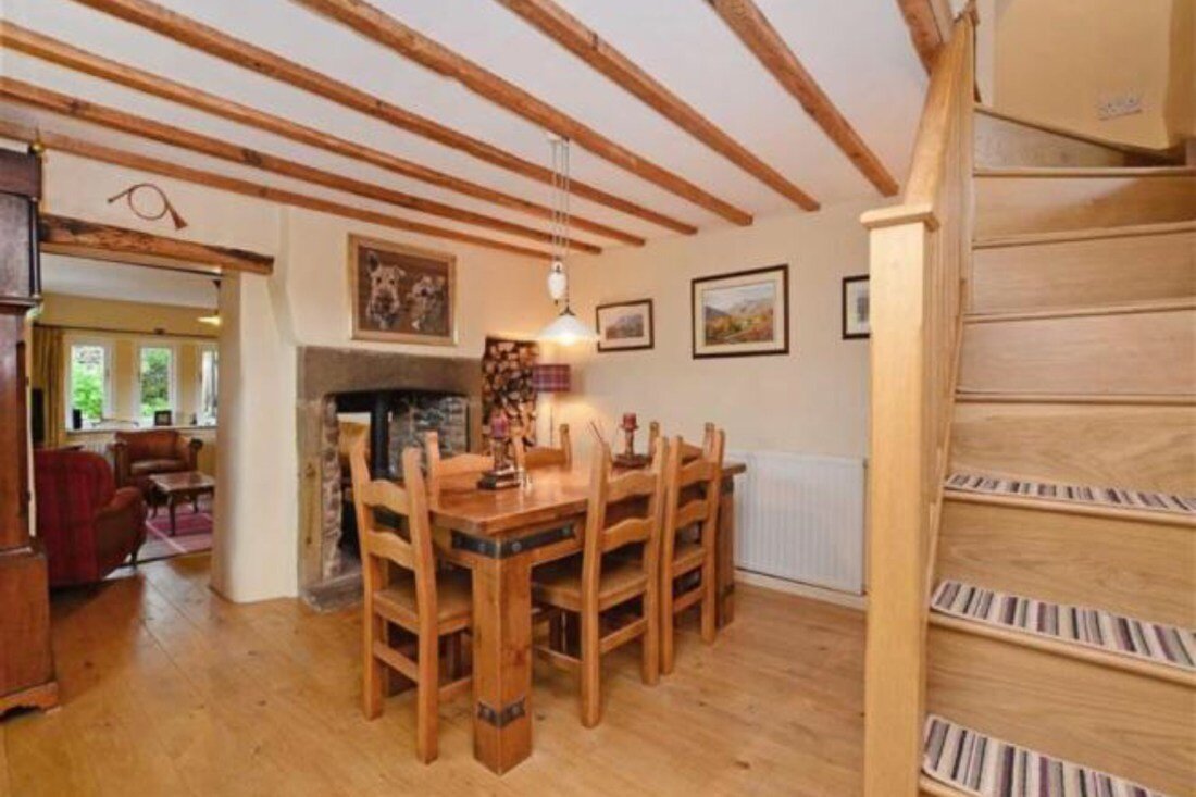
A simple dining room before and after makeover
Our dining room isn’t really a dining room.
It’s also my office, a hallway, a library, the throughway to the kitchen and where my favourite window seat in the house is. This room works hard. It’s the oldest part of our cottage so it’s full of old world character but knowing how to arrange and organise the space was tricky. I had to try and section the room so each area functioned as I needed it to but I also wanted a natural cohesive feel. To add to this challenge there are only windows on one side so the back of the room can get dark very quickly.
The previous owners used this space in a similar way that we do in that it was multifunctional for them too. They cleverly installed the double sided log burner when they extended the cottage which married both sides of the wall together nicely. This side is the original fireplace and logs used to pile high next to it but it made more sense to have these in the living room. I was left with the perfect spot to store my beloved books. Space is tight but I quite like that. It means I re-evaluate what books deserve a space on a regular basis and give plenty away to lighten my load.
I knew I wanted a bright simple space that felt cosy and this brief made most of the furniture decisions for me. Adding a mirror to the back of the room bounces the light around and reflects the view we’re oh so grateful to have. The dining table was the most difficult piece of furniture to find. Having my heart set on a textured wooden farmhouse design had me hunting high and low around websites, antique shops and regular shops. I finally found this one at Louisa Grace Interiors.
The legs were originally painted dark but Louisa was happy to alter this for me. I love the weathered patina top though I am tempted to lighten it – but I’m too scared in case I ruin it. I wouldn’t even know where to start to be honest. If you’ve any tips let me know. The dining chairs are all from HAY design but mixing the colours and styles means everything doesn’t look too matchy matchy. Finding chairs the right height for the table was trial and error and in the end we took a few centimetres off the table legs. The ceramic light hanging over the table came with the house and I’ve no idea who made it but I feel so lucky we inherited this.
The whole room, stairs and windows are painted in Loft White by Little Greene (which I received a press discount for). I’ve been really pleased with the quality of this paint and I love how environmentally friendly it is, but the colour was always a bit too on the blue tint side if I’m being honest with myself. It’s been two years sine we decorated this room now and I’m ready to have another go. I feel like I know the light better and I know my own style better. Even though the room faces south so the light is warm, because of the northern UK light things can get gloomy very quickly. I think I’m going to switch to an oyster white instead and I really like the look of Farrow & Ball’s School House White.
The floor has been through the ringer thanks to my experimenting. It was stained that orangey oak when we moved in. We had it sanded and stained dark – we all know what a mistake that was – then it was re-sanded and stained in a light natural finish and I’m thrilled with it. The room feels so much bigger with a lighter floor. The ceiling beams are original and underwent the same treatment. Like the floor I much prefer them light but I’m still glad I experimented. The only way to figure out what we really like is to try things.
In an ideal world my office would be by the window where my desk could bathe in light but because this is a main walkway and the space is tight, it makes no sense. I feel a bit like Harry Potter under the stairs but I can’t deny its cosiness. My desk was a tricky one to find as the space dictates the size of it but I found this one on eBay and painted it Annie Sloan Old White. This is where all my work lives with the trolley at the side filled with extra stationery and arty supplies. I added a desk lamp for more focused lighting but honestly I’m most likely to work at the table where I can really spread out and enjoy the view.
The entrance to the cottage doesn’t even classify as a hallway but we make the best of it by keeping it clutter free. I think a clutter free entrance is super important because it sets the tone of the house and can either welcome you in or leave you wanting to run for the hills. We keep most of our coats and shoes upstairs to free up this space. The coat rack by the door was a very cheap eBay find and it’s buckled under the weight of coats now. I need to replace it with something a bit sturdier. I think I’ll go for the oak peg rails I love so much in other rooms around the house.
The front door was solid oak but I had a joiner take out some of the original door and replace it with glass to let more light in. This worked a treat. I don’t think you can ever have too much light. The orange oak wasn’t really my style so I painted the door Pavillion Grey and although I love how country the light grey looks, I wish I’d painted it an off white now and I think that’s what I’ll go for next time.
Having a separate dining room worried me initially as I really enjoyed an open kitchen diner in our old house but it hasn’t bothered me at all. I actually like that you can’t see the kitchen mess, and of course we always eat off our lap trays in the living room anyway. We only ever eat at the dining table if it’s a special occasion or we have guests over.
As much as I love the window seat it still doesn’t feel quite finished to me. I’m not sure if it needs blinds or curtains to frame the view. Part of me thinks it would benefit from being deepened or a bespoke cushion made for it so it was a comfier sit. I’m not sure. Moving forwards I’d like to fill the bottom of the under stairs space with fitted system that would hide clutter and store shoes flat. Having shoes in the basket drives me nuts and I’d like to keep them out of sight. I’ve also considered a bureau instead of a desk so I could up the storage and let go of the trolley.
All this tinkering is what I love most about a slow home interior approach. Nothing is ever finished and there’s no rush to get it right. Once I realised a home is never done and I’ll always want to tinker with things the whole process became much more enjoyable and meditative.
Hope you enjoyed that little update and a nosey!


